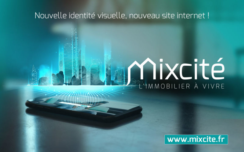
This new visual identity illustrates the evolution of the company, the desire to go further, to do even better, and marks a new stage in its development and its future ambitions.
While retaining the fundamentals of the brand (name, colors), the construction of the logo gives way to a new symbol “the M”, a strong graphic icon that links it to the Real Estate Promotion activity. The precision of the “M anchored in the ground like a bubble of dialogue” and the affirmation of the Mix versus city echoes the company’s expertise, its dual capacity to create real estate to live in new and old around a central concern, the mix of uses. The strong symbol of the “M” is associated with a serif font to bring more elegance and a lower-case typography that evokes proximity with its stakeholders. This new logo is accompanied by a new signature “L’IMMOBILIER A VIVRE”, a resolutely positive, unique and more emotional baseline to reinforce the brand promise of “good living for users”. Finally, the removal of the frame around the brand symbolizes the openness of the company in its way of innovation and dialogue.
As part of this new visual identity, the new website now has a sleek, modern design and reinforces Mixcité’s positioning and values.
“Because we aspire to places where everyone recognizes themselves and feels good, Mixcité acts for a local, mixed, open, sustainable, personalized real estate, designed to listen to users.”